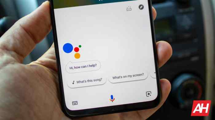
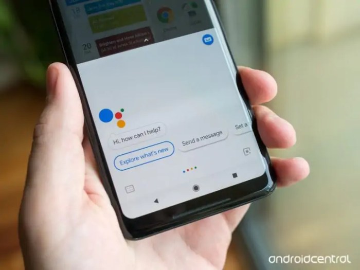
Google Assistant dedicated buttons on phones: Ever wondered about that little button on your phone? It’s more than just a pretty face; it’s a direct line to Google’s powerful AI assistant. From its humble beginnings to its current capabilities, this handy shortcut has revolutionized how we interact with our smartphones. We’re diving deep into the history, functionality, and future of this surprisingly versatile feature, exploring everything from the technical nitty-gritty to user experiences and comparisons with rival virtual assistants.
This exploration will cover the evolution of the button’s design and functionality across various Android versions and phone models, analyzing user feedback and market reception along the way. We’ll also dissect the button’s various actions – single, double, and long presses – and weigh the pros and cons against relying solely on voice activation. Get ready for a tech deep-dive that reveals the surprising power packed into this tiny button.
Functionality and User Experience of Dedicated Google Assistant Buttons
The dedicated Google Assistant button, a physical shortcut to the digital assistant, promises a streamlined user experience. But does it deliver on that promise? Let’s delve into the functionality, user experience, and explore potential improvements.
Button Press Actions
The functionality of the dedicated Google Assistant button hinges on different press actions. Understanding these variations is crucial for optimal use.
- Short Press: A single, brief press typically activates Google Assistant, ready to receive voice commands. This is the most frequently used function, offering quick access for simple tasks like setting reminders or playing music.
- Long Press: Holding the button down usually initiates a different action, often opening the Google Assistant interface directly on the screen. This allows for more complex interactions or browsing of Assistant features without relying solely on voice commands.
- Double Press: A double-tap, depending on phone manufacturer and software version, may activate a pre-defined shortcut, such as launching a specific app or triggering a custom routine. This functionality adds versatility, enabling personalized automation.
Advantages and Disadvantages of Dedicated Buttons
The introduction of a dedicated button presents both advantages and drawbacks compared to relying solely on voice activation.
- Advantages: The primary advantage is speed and convenience. A quick press offers immediate access to the Assistant, particularly useful in situations where voice activation might be impractical or impossible (e.g., noisy environments). The tactile feedback of a physical button provides confirmation of the action, improving user confidence. It also offers an accessible alternative for users who find voice commands challenging.
- Disadvantages: Accidental presses can be frustrating, potentially triggering unwanted actions. The button’s placement on the phone might not be ideal for all users, affecting ease of access. Furthermore, the added hardware increases the phone’s cost and complexity.
User Experiences and Accessibility
User reviews reveal a mixed bag. Many appreciate the convenience and speed, especially those with dexterity issues or in environments with high background noise. However, complaints about accidental activations are common, particularly from users with larger hands or those who carry their phones in pockets. The accessibility aspect is a double-edged sword; while it aids some, the lack of customization for diverse needs remains a concern. Some users report difficulty in discerning between a short and long press, leading to inconsistent results.
Proposed UI Mock-up Improvements
A redesigned interface could address some of these issues. Imagine a customizable settings menu for the button. Users could select specific actions for short, long, and double presses from a comprehensive list. This could include not only pre-defined actions but also the ability to assign custom routines or shortcuts. Furthermore, haptic feedback could be adjusted to provide clearer distinction between different press durations. Visual cues on screen, such as a brief animation or notification, could confirm the initiated action, minimizing accidental presses and improving the overall user experience. The design should prioritize clear visual separation of options and intuitive navigation. For example, a simple toggle switch for each press type would allow for easy selection and modification of the assigned functions.
Comparison with Other Virtual Assistants’ Button Implementations: Google Assistant Dedicated Buttons On Phones
The dedicated Google Assistant button, while convenient, isn’t alone in its quest for voice-activated dominance. Several other virtual assistants boast similar hardware integrations, each with its own strengths and weaknesses. Comparing these implementations reveals interesting insights into user experience design and the evolving landscape of voice-activated technology. This comparison focuses on functionality, user experience, and accessibility features, highlighting best practices and innovative approaches.
A direct comparison of Google Assistant’s dedicated button with those of Siri and Bixby reveals a fascinating interplay of design choices and technological capabilities. While all aim for seamless voice interaction, the approaches differ significantly, leading to varied user experiences and levels of accessibility.
Functionality Comparison of Virtual Assistant Buttons
The core functionality of all three – Google Assistant, Siri, and Bixby – centers around voice activation and quick access to core features. However, nuances exist. Google Assistant’s button often provides a more customizable experience, allowing users to assign specific commands or actions to long-presses or double-taps. Siri, on the other hand, primarily focuses on initiating a general voice command, with less customization readily available. Bixby, depending on the device, might offer a slightly more integrated approach, potentially triggering device-specific functions in addition to general voice commands. The level of integration with the phone’s operating system also varies. Google Assistant buttons frequently offer a more seamless integration, while Bixby’s might sometimes feel slightly more isolated, requiring more steps for certain tasks.
User experience is subjective, yet certain patterns emerge. Google Assistant’s button placement and tactile feedback often receive positive reviews for ease of use. The responsiveness and speed of the assistant’s activation are also key factors. A sluggish response can significantly detract from the overall experience, a point where both Siri and Bixby have seen occasional criticism. The visual feedback – the on-screen display indicating the assistant is listening – also plays a crucial role. A clear and intuitive visual cue improves the user’s understanding of the system’s state. The level of contextual awareness also impacts the user experience. An assistant that understands the user’s current context and anticipates needs provides a smoother and more natural interaction.
Accessibility Features of Virtual Assistant Buttons
Accessibility is a critical aspect often overlooked. Features like customizable voice commands, support for alternative input methods (like text input), and clear auditory feedback are crucial for users with disabilities. While all three assistants offer some level of accessibility, the implementation and extent of these features vary. For example, Google Assistant might offer more granular control over notification sounds and voice customization options. Siri’s accessibility features might be more focused on screen reader compatibility. Bixby’s implementation could vary significantly depending on the specific device and software version. A detailed evaluation of each assistant’s accessibility settings is necessary for a thorough comparison.
Comparative Table of Virtual Assistant Button Implementations
| Feature | Google Assistant | Siri | Bixby |
|---|---|---|---|
| Customization Options | High (long press, double tap actions) | Medium (limited to basic voice commands) | Medium (varies by device and software version) |
| Responsiveness | Generally fast | Can be inconsistent | Can be inconsistent |
| Accessibility Features | Strong (customizable voice, notifications) | Good (screen reader compatibility) | Varies significantly by device |
| System Integration | Excellent | Good | Moderate (can feel isolated) |
| Visual Feedback | Clear and intuitive | Adequate | Adequate |
From its initial integration to its potential future iterations, the Google Assistant dedicated button has undeniably reshaped smartphone interaction. While challenges remain in optimizing user experience and accessibility, its evolution reflects a broader trend towards seamless AI integration in our daily lives. The button’s ongoing development promises even more intuitive and efficient ways to access information and complete tasks, paving the way for a more hands-free and connected future. The little button is more than just a shortcut; it’s a glimpse into the evolving landscape of mobile technology.
 Blockchain Essentials Berita Teknologi Terbaru

